 지혜의 개발공부로그
Matplotlib 사용해보기(산점도 scatter)
08 Aug 2025 | Visualization개인공부 후 자료를 남기기 위한 목적임으로 내용 상에 오류가 있을 수 있습니다.
Matplotlib
import matplotlib.pyplot as plt
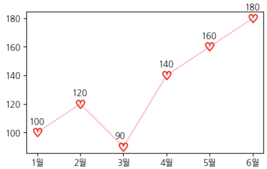
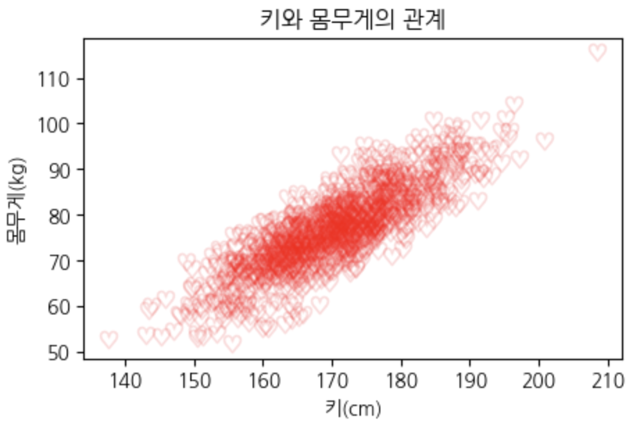
scatter 산점도
- 가로축, 세로축 모두 수치형 받음
- 범주 넣을 순 있지만 활용도 떨어짐
- 데이터 간의 얼마나 흩뿌려져있는가를 확인 할 때 사용
- 데이터 간의 분포를 확인할 때 사용
회귀선, 추세선 같은 것과 조합해서 많이 사용
# 샘플 데이터: 20명의 키(cm)와 몸무게(kg)
np.random.seed(42)
heights = np.random.normal(170, 10, 1000)  # 평균 170cm, 표준편차 10
weights = heights * 0.8 - 60 + np.random.normal(0, 5, 1000)  # 키에 비례 + 노이즈
plt.figure(figsize=(5,3))

# scatter에서는 alpha값이 중요하다
# 낮은 알파값으로 데이터의 중복을 진하게 표현가능하다 > 데이터가 밀집된 곳 표현이 가능
plt.scatter(heights, weights,
            s=80,  # 마커(점) 사이즈
            marker=r'$\heartsuit$',
            color='red',
            alpha=0.1
            )

plt.title('키와 몸무게의 관계')
plt.xlabel('키(cm)')
plt.ylabel('몸무게(kg)')
plt.show()
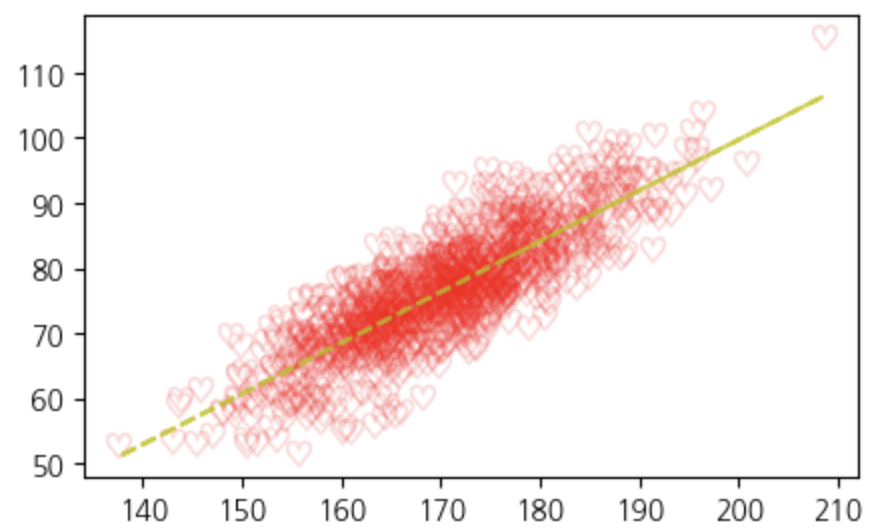
추세선 추가하기
plt.figure(figsize=(5,3))
plt.scatter(heights, weights,
            s=80,  # 마커(점) 사이즈
            marker=r'$\heartsuit$',
            color='red',
            alpha=0.1
            )

# 추세선을 계산
z = np.polyfit(heights, weights, 1)  # 1: 1차 방정식 / polyfit: 1차 다항식을 이용해서 추세선을 나타내는 기울기와 절편
p = np.poly1d(z)  # 계산된 z를 사용해 다항식 함수 p를 생성
plt.plot(heights, p(heights), '--', alpha=0.8, color='y')  # p로 예측된 값을 선으로 그리는 함수

plt.show()