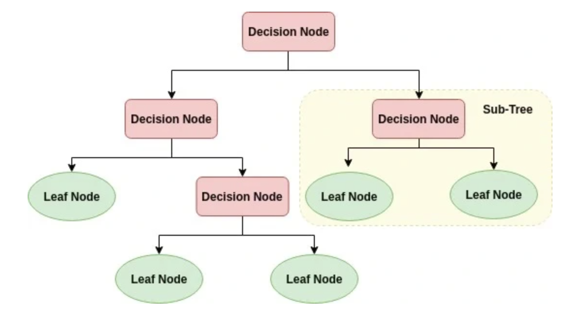
의사결정트리는 분류와 같은 의사결정을 수행할 때, 나무와 같이 가지치기를 하면서 분류하는 방법이다.
이 결정트리는 분류와 회귀모델 모두 사용가능하지만, 회귀모델의 정확도는 낮기 때문에 주로 분류의 목적으로 사용된다.
규칙노드(decision node)로 표시된 노드는 규칙 조건이 담겨져 있고,
리프노드(lead node)로 표시된 노드는 결정된 클래스 값, 즉 지니가 0이 되어 더이상 분할이 필요없는 말단노드를 의미한다.
그리고 새로운 규칙조건마다 서브트리(sub tree)가 형성되는데 데이터 셋에 피쳐(feature -> y)가 있고, 이 피처가 결합해
규칙 조건마다 서브트리가 생성되는 것이다.
하지만 많은 규칙이 있다는 것은 곧 분류를 결정하는 방식이 더욱 복잡해진다는 뜻으로 과잡합이 되기가 쉬워진다. 그렇기 떄문에
트리의 깊이(depth)가 깊어질수록 결정트리의 예측 성능이 저하될 가능성이 높아진다.
가능한한 적은 결정 노드로 높은 예측 정확도를 가지기 위해서는 데이터를 분류할 때, 최대한 많은 데이터 셋이 해당 분류에 속할 수 있도록
결정 노드의 규칙이 정해져야 한다. 즉 결정노드의 규칙이 굉장이 중요한 것을 의미한다.
이를 위해서는 트리를 분할(split)할 것인가가 중요한데, 최대한 균일한 데이터 셋을 구성할 수 있도록 분할하는 것이 굉장히 중요하다.
결정노드는 정보 균일도가 높은 데이터 셋을 먼저 선택할 수 있도록 규칙조건을 만드는데, 이 정보의 균일도를 측정하는 대표적인 방법이 엔트로피를 이용한 정보이득지수와 지니계수인 것이다.
지니불순도와 엔트로피
각 노드에서 판단하기 위한 두개의 기준은 다음과 같다.
(의사결정트리가 데이터를 어떻게 분할할지 결정하는 역할)
지니불순도: 데이터의 불순도 혹은 혼잡도를 측정하는 지표
지니불순도가 0 이상 1에 가까워질수록 불순도가 있다는 의미
0이 되면 최고 순도로 더이상 분할이 필요없다는 것을 의미
지니계수가 낮은 속성을 기준으로 분할
[Gini = 1 - \sum_{j=1}^J p_j^2]
엔트로피(정보이득지수): 데이터 분포의 순수도를 나타내는 척도(불확실성을 나타내는 지표)
서로 다른 값(정보)이 많이 섞여 있으면 엔트로피가 높고, 같은 값(정보)가 섞여있으면 엔트로피가 낮음
데이터의 순도가 높을수록 엔트로피 값은 낮아지고 불순도가 높을수록 엔트로피 값은 높아짐
정보이득지수 = 1 - 엔트로피지수
정보이득이 높은 속성을 기준으로 분할함
[Entropy = - \sum_{j=1}^{J} p_j \log_2(p_j)]
구성
노드(node)
뿌리마디(root node): 시작되는 마디
자식마디(child node): 마디에서 분리된 2개 이상의 마디
부모마디(parent node): 주어진 마디의 상위 마디
끝마디(leaf node): 자식 마디가 없는 마디 > 최종클래스(레이블)값이 결정되는 노드
중간마디(internal node): 부모, 자식마디 둘다 있는 마디
가지(branch, edge): 선
깊이(depth): 중간마디들의 수
특징
장점
정보의 균일도를 기반으로 하고있어 알고리즘이 쉽고 직관적임
시각화로 표현 가능
스케일링이나 정규화 같은 전처리 작업이 필요없음(정보의 균일함만 보면 됨)
단점
모든 데이터 상황을 만족하도록 트리 조건을 계속 추가하다보면 과적합이 발생함
모든 데이터 상활을 만족할 필요는 없게 사전에 트리 크기를 제한하는 것이 필요
즉 하이퍼파리미터를 통해 성능을 높여나가는 것이 중요!
criterion:
    - 분류 "gini"|"entropy"
    - 회귀 "squared_error"|"friedman_mse"|"absolute_error"

max_depth: 트리 최대 깊이(과적합 강력 제어)
min_samples_split: 분할 최소 샘플 수(노이즈 분할 억제)
min_samples_leaf: 리프 최소 샘플 수(일반화↑, 편향 약간↑)
max_features: 분할 시 고려할 특징 수(랜덤성 부여)
class_weight: 불균형 분류 가중치(예: `"balanced"`)
ccp_alpha: 비용-복잡도 가지치기 강도(0→성장, ↑→단순 트리)
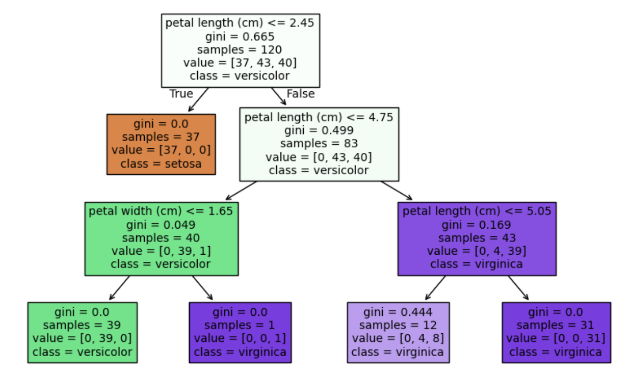
실습
# 라이브러리 불러오기
importpandasaspdimportnumpyasnpfromsklearn.datasetsimportload_iris#아이리스 데이터
fromsklearn.model_selectionimporttrain_test_split#데이터 분리
fromsklearn.treeimportDecisionTreeClassifier,plot_tree# 단일 트리모델, 트리그림 확인
importmatplotlib.pyplotasplt# 시각화
# 데이터 불러오기
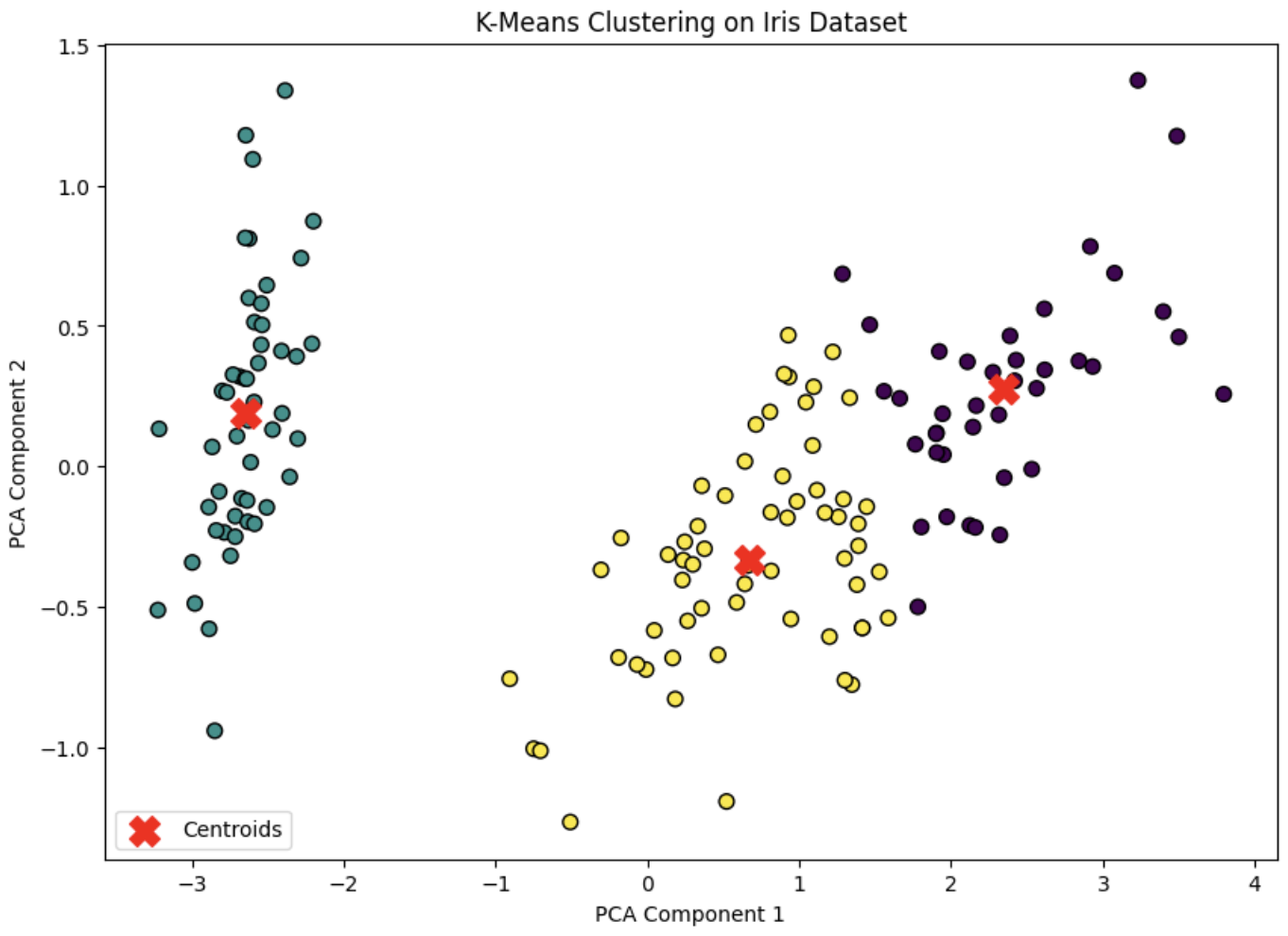
iris=load_iris()X=iris.datay=iris.target# 데이터 분할
X_train,X_test,y_train,y_test=train_test_split(X,y,test_size=0.2)# 트리모델 정의 > Clissifier 단일트리모델 분류모델
# max_depth가 작다? = 분류가 잘 안됨 / max_depth가 너무 많다? = 과적합, 의사결정 잘 안됨
# 적절한 max_depth를 하는 것이 중요
clf=DecisionTreeClassifier(random_state=42,max_depth=3,criterion='gini')# 모델 훈련
clf.fit(X_train,y_train)# 정확도 확인
clf.score(X_train,y_train)# 0.9666666666666667
clf.score(X_test,y_test)# 0.9333333333333333
이때 마지막 두 값을 비교해 모델 성능이 괜찮은지 아닌지를 판단해야한다.
현재 결과는 train이 test 결과보다 정확도가 더 높은 것을 볼 수 있다. > 오버피팅
이때 이 과적합이란, 모델이 학습(train) 데이터에만 과도하게 최적화되어 실제 예측을 다른 데이터로 수행할 경우
예측 성능이 떨어지는 경우를 의미한다.
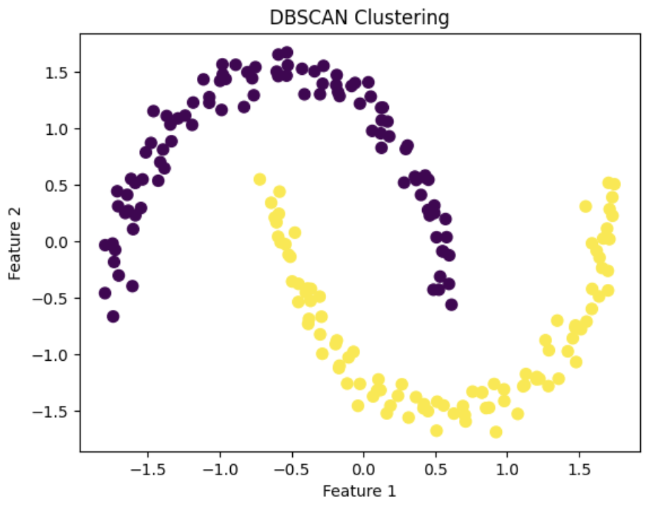
유클리드 거리 기반의 k-means와 달리 오밀조밀 몰려있는 클러스터를 군집하는 방식을 사용
따라서 원 모양이 아닌 불특정한 형태의 군집도 존재함
클러스터가 최초의 임의의 점 하나로부터 점점 퍼져나가는데, 그 기준이 바로 일정 반경 안의 데이터의 밀도임
K-means와의 차이점
K-Means: 클러스터의 중심(센트로이드)를 기준으로 데이터를 나눔
각 데이터의 거리를 계산해(유클리드 거리 기반) 그룹간 적정 수준의 거리에 따라 그룹을 구분
이때 클러스터의 수(K)를 미리 정해줘야 함
이상치에 굉장히 민감함! > 하나의 이상치가 중심을 크게 바꿀 가능성이 있음
DBSCAN: 밀도 기반으로 클러스터를 생성함
특정 반경 안에 min_samples 개수 이상의 점이 있다면, 밀집 구역으로 보고 클러스터로 간주함
즉 클러스터 수(K)를 미리 정할 필요가 없음 > 알아서 정해줌
군집에 속하지 못할 경우 noise(잡음)로 분류됨
KMeans = “내가 몇 개 그룹이 필요해!” 하고 미리 정한 후에 거리에 따라 빠르게 분류
DBSCAN = “데이터의 밀도에 따라서, 알아서 뭉쳐보자” + “이상치는 빼자”
그럼 각각 언제 사용하는 것이 좋을까?
2개의 모델을 다써보고 설명력이 더 좋은것을 선택
데이터의 상태를 봤을 때, 더 적합한 모델을 선택하는 식으로 선택
K-means
데이터가 구형이나, 블록으로 나뉠 떄(거리니까 거리에 따라서 분류되는게 좋을떄)
클러스터 갯수를 알고 있을떄
속도와 단순한 것이 더 좋을떄 + (K-means가 DBSCAN보다 속도가 더 빠름)
“대규모 데이터 분류, 라벨이 없는 데이터, 군집의 수를 알 떄”
DBSCAN
데이터에 이상치(Outlier)가 많을 떄
클러스터 개수를 모를떄
클러스터가 구형이 아닐떄 (한곳에 몰려있는 형태)
데이터가 저차원 (2,3D)에 가까울때
“이상치가 많은 데이터, 복잡한 모델을 분류할 때”
실습해보기 1
코어포인트 생성(eps반경 내 min_samples개 이상의 점이 존재하는 중심점)
코어포인트로부터 거리 측정(eps)
그 거리안 최소 갯수 설정(min_samples)
border poins: 군집의 중심은 못되지만 군집에는 속하는 점
noise point: 군집에 포함되지 못하는 점
# 라이브러리 불러오기
importnumpyasnpimportmatplotlib.pyplotaspltfromsklearn.datasetsimportmake_moonsfromsklearn.preprocessingimportStandardScalerfromsklearn.clusterimportDBSCAN# 데이터 불러오기
X,_=make_moons(n_samples=200,noise=0.05,random_state=0)# 데이터 전처리(>정규화)
scaler=StandardScaler()X_scaled=scaler.fit_transform(X)# 모델 정의
dbscan=DBSCAN(eps=0.4,min_samples=2)# eps: 거리
dbscan_labels=dbscan.fit_predict(X_scaled)# 시각화
plt.scatter(X_scaled[:,0],X_scaled[:,1],c=dbscan_labels,cmap='viridis',s=50)plt.title('DBSCAN Clustering')plt.xlabel('Feature 1')plt.ylabel('Feature 2')plt.show()
실습해보기 2
# 라이브러리 불러오기
fromsklearn.datasetsimportmake_blobs# 데이터 불러오기
X,_=make_blobs(n_samples=300,cluster_std=0.6,random_state=42)# 데이터 정규화
scaler=StandardScaler()X_scaled=scaler.fit_transform(X)# 모델 정의
dbscan=DBSCAN(eps=0.1,min_samples=2)# dbscan = DBSCAN(eps=2, min_samples=2)
dbscan_labels=dbscan.fit_predict(X_scaled)# 시각화
plt.scatter(X_scaled[:,0],X_scaled[:,1],c=dbscan_labels,cmap='viridis',s=50)plt.title('DBSCAN Clustering')plt.xlabel('Feature 1')plt.ylabel('Feature 2')plt.show()
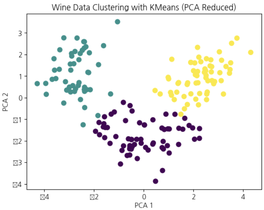
# 라이브러리 불러오기
fromsklearn.datasetsimportload_winefromsklearn.preprocessingimportStandardScalerfromsklearn.clusterimportKMeansfromsklearn.metricsimportadjusted_rand_scorefromsklearn.decompositionimportPCAimportmatplotlib.pyplotasplt# 데이터 불러오기
data=load_wine()X=data.data# 데이터 전처리(> 정규화)
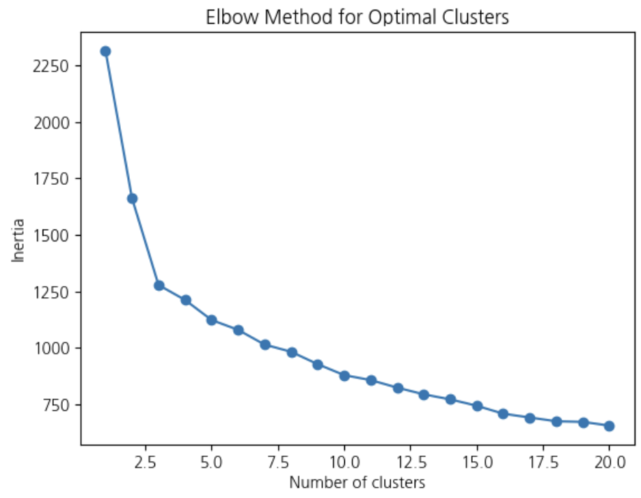
X_scaled=StandardScaler().fit_transform(X)# 최적의 클러스터 수 찾기 > 엘보우 방법으로 클러스터 수를 1~20까지 설정
# 각 경우의 inertia값을 구하기 > 이를 엘보우 그래프를 통해 최적의 클러스터 수 정하기
inertia=[]K_range=range(1,21)# for문 돌면서 거리합을 구함
forkinK_range:kmeans=KMeans(n_clusters=k,random_state=42)kmeans.fit(X_scaled)inertia.append(kmeans.inertia_)plt.plot(K_range,inertia,marker='o')plt.title('Elbow Method for Optimal Clusters')plt.xlabel('Number of clusters')plt.ylabel('Inertia')plt.show()# kmeans 클러스터링
kmeans=KMeans(n_clusters=3,random_state=42)kmeans.fit(X_scaled)# 각 클러스터의 레이블 저장
kmeans_labels=kmeans.labels_# 클러스터링 성능평가 > adjusted_rand_score
y=data.targetprint("Adjusted Rand Index:",adjusted_rand_score(y,kmeans_labels))# 결과 시각화
pca=PCA(n_components=2)X_pca=pca.fit_transform(X_scaled)plt.scatter(X_pca[:,0],X_pca[:,1],c=kmeans_labels,cmap='viridis',s=50)plt.title('Wine Data Clustering with KMeans (PCA Reduced)')plt.xlabel('PCA 1')plt.ylabel('PCA 2')plt.show()
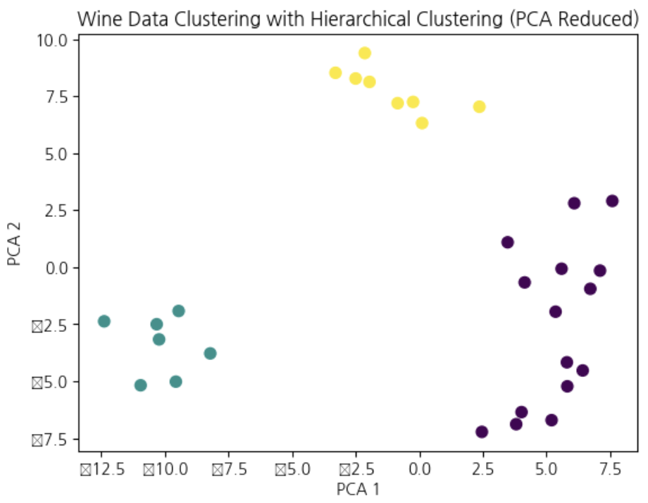
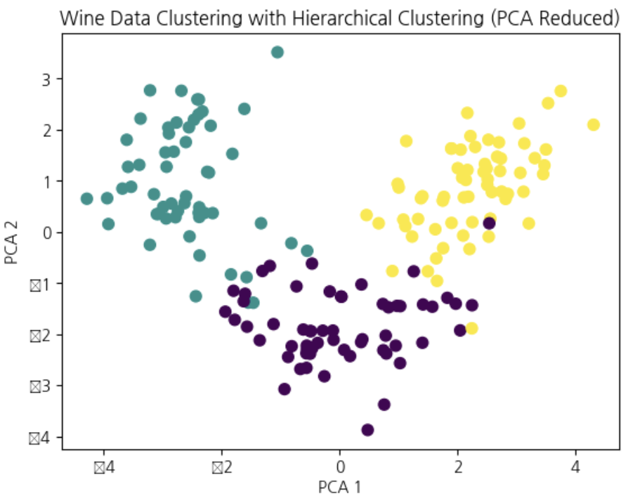
fromsklearn.clusterimportAgglomerativeClusteringfromsklearn.decompositionimportPCA# 3개 할 것이라고 지정
optimal_clusters=3# 예측하고
hierarchical=AgglomerativeClustering(n_clusters=optimal_clusters,linkage='ward')hierarchical_labels=hierarchical.fit_predict(X)# 이를 pca로 넣어준다
pca=PCA(n_components=2)X_pca=pca.fit_transform(X)plt.scatter(X_pca[:,0],X_pca[:,1],c=hierarchical_labels,cmap='viridis',s=50)plt.title('Wine Data Clustering with Hierarchical Clustering (PCA Reduced)')plt.xlabel('PCA 1')plt.ylabel('PCA 2')plt.show()
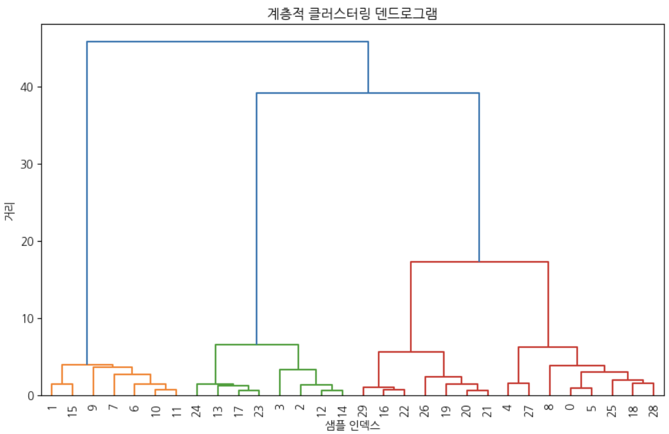
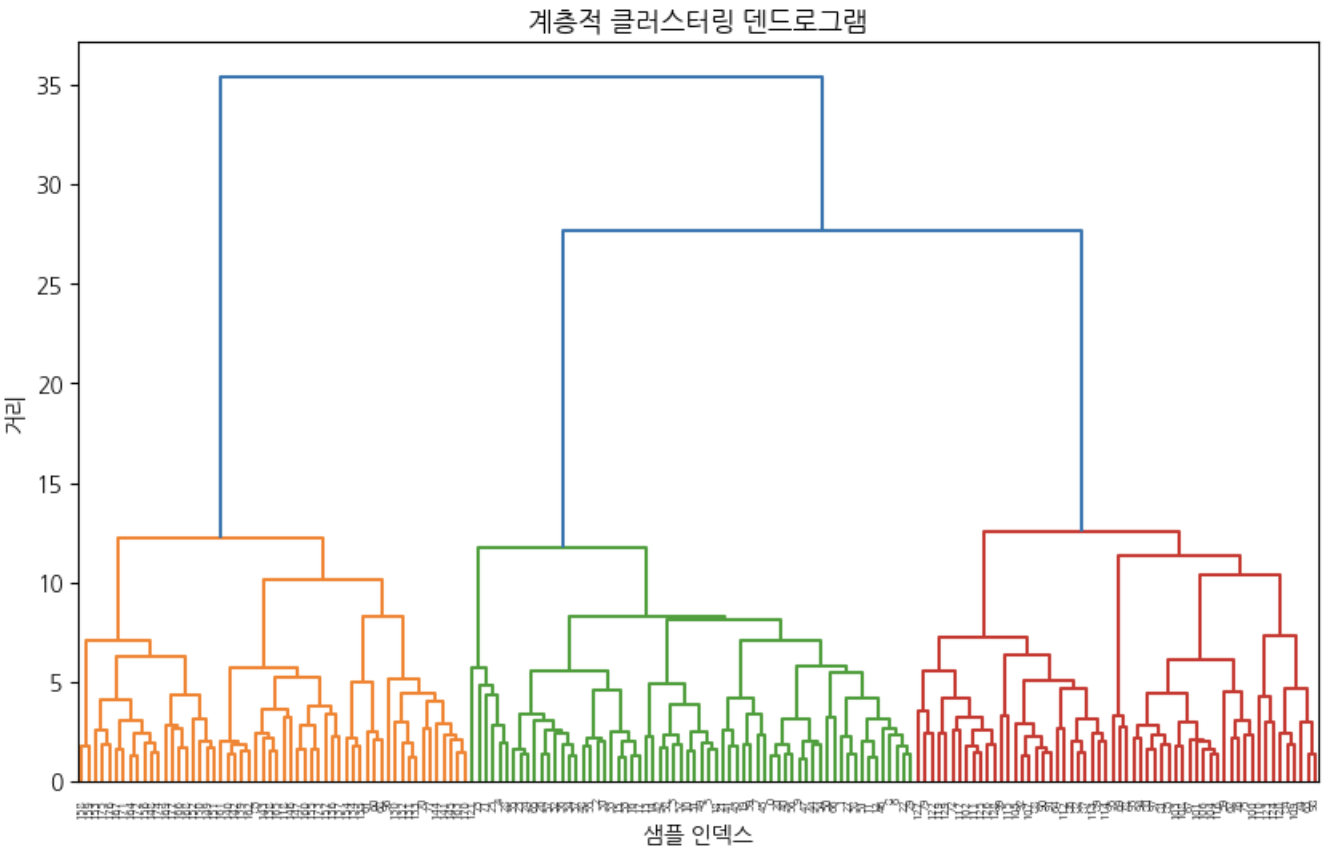
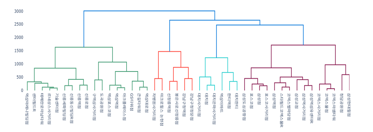
shc를 이용해 와인데이터 계층적 클러스터링 진행해보기
# 라이브러리 불러오기
fromsklearn.datasetsimportload_wineimportnumpyasnpimportmatplotlib.pyplotaspltfromscipy.cluster.hierarchyimportdendrogram,linkage#덴드로그램 라이브러리
fromsklearn.datasetsimportmake_blobsimportscipy.cluster.hierarchyasshc# 데이터 불러오기
data=load_wine()X=data.datay=data.target# 데이터 전처리 (> 정규화)
X_scaled=StandardScaler().fit_transform(X)# 덴드로그램 그리기
plt.figure(figsize=(12,8))shc.dendrogram(shc.linkage(X_scaled,method='ward'))plt.title('계층적 클러스터링 덴드로그램')plt.xlabel('샘플 인덱스')plt.ylabel('거리')plt.show()# 계층적 클러스터링
hierarchical_labels=AgglomerativeClustering(n_clusters=3,linkage='ward').fit_predict(X_scaled)# 클러스터링 성능 평가
print("Adjusted Rand Index:",adjusted_rand_score(y,hierarchical_labels))# 결과 시각화
pca=PCA(n_components=2)X_pca=pca.fit_transform(X_scaled)plt.scatter(X_pca[:,0],X_pca[:,1],c=hierarchical_labels,cmap='viridis',s=50)plt.title('Wine Data Clustering with Hierarchical Clustering (PCA Reduced)')plt.xlabel('PCA 1')plt.ylabel('PCA 2')plt.show()
Adjusted Rand Score (ARS)
Adjusted Rand Score는 두 클러스터링 결과의 유사도를 측정하며, 우연히 일치할 확률을 보정한 지표
ARS = (RI - Expected_RI) / (Max_RI - Expected_RI)
여기서:
RI: Rand Index
Expected_RI: 무작위 클러스터링의 기대값
Max_RI: 최대 가능한 Rand Index (=1)
거리 측정 방법 비교
1. Single Linkage (최단 연결법)
두 클러스터 간의 최소 거리를 기준으로 정의
두 클러스터 $A, B$ 사이 거리:
[D_{\text{single}}(A, B) = \min_{x \in A, \, y \in B} d(x, y)]
가장 가까운 두 점을 연결하는 방식 → 체인(chain) 형태로 묶이는 경향이 있음
2. Complete Linkage (최장 연결법)
두 클러스터 간의 최대 거리를 기준으로 정의
두 클러스터 $A, B$ 사이 거리:
[D_{\text{complete}}(A, B) = \max_{x \in A, \, y \in B} d(x, y)]
가장 먼 두 점을 기준으로 병합 → 구 모양의 클러스터를 잘 찾음
3. Average Linkage (평균 연결법, UPGMA)
클러스터 간의 모든 점들 사이 거리의 평균을 사용
두 클러스터 $A, B$ 사이 거리:
[D_{\text{average}}(A, B) = \frac{1}{
A
\,
B
} \sum_{x \in A} \sum_{y \in B} d(x, y)]
전체적으로 균형 잡힌 클러스터를 찾는 데 유리
4. Ward’s Method (분산 최소화 방법)
클러스터 병합 시, **클러스터 내 제곱합(Within-Cluster Variance, SSE)**의 증가량이 최소가 되도록 함.
수식 (클러스터 $A, B$ 병합 시 비용):
[D_{\text{ward}}(A, B) = \frac{
A
\,
B
}{
A
+
B
} \, | \bar{x}_A - \bar{x}_B |^2]
여기서
$\bar{x}_A$ = 클러스터 $A$의 평균 벡터
$\bar{x}_B$ = 클러스터 $B$의 평균 벡터
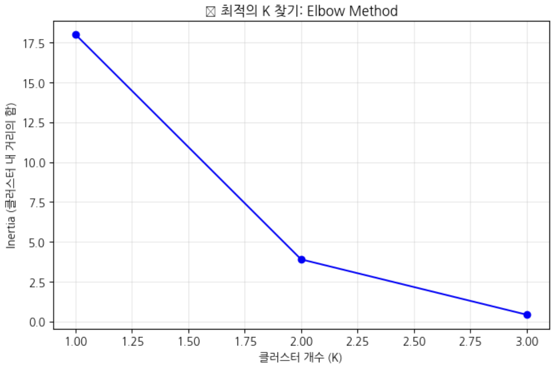
갯수마다의 증감 차이를 봐야하며 어느순간 덜 줄어드는 때를 봐줘야 함 > 최적의 군집을 찾는게 중요
k가 증가하면 SSE(에러의 합)이 줄어드는 것을 보는 것으로 최적 k는 SSE 감소율이 급격히 줄어드는 팔꿈치 지점임
센트로이드와 점들의 거리를 에러 > 이 에러의 합을 줄이는게 목표
# 다양한 K값에 대해 성능 측정
inertias=[]K_range=range(1,4)# for문 돌면서 거리합을 구함
forkinK_range:kmeans=KMeans(n_clusters=k,random_state=42)kmeans.fit(X)inertias.append(kmeans.inertia_)# 엘보우 그래프 그리기
plt.figure(figsize=(8,5))plt.plot(K_range,inertias,'bo-')plt.xlabel('클러스터 개수 (K)')plt.ylabel('Inertia (클러스터 내 거리의 합)')plt.title('📈 최적의 K 찾기: Elbow Method')plt.grid(True,alpha=0.3)plt.show()# 팔꿈치 부분이 최적의 K!
1개였을떄의 거리합과 2개였을때의 거리합이 확연히 줄어드는 것을 볼 수 있다.
실루엣: for문 돌면서 predict, predict에서 실루엣 한 것을 클러스터에 얼마나 잘 속해있는 지를 측정함
하나의 군집을 클러스터라고 하는데, 같은 클러스터 내 센트로이드와 다른 점들과의 거리를 재고 가장 가까운 다른 클러스터 까지의 평균거리를 가지고 계산식으로 실루엣 계수를 정함
실루엣 계수가 크면 적절(1에 가까우면)
음수는 이상치가 많이 껴있을 경우로 잘못된 클러스터에 할당된 것
0에 가까울수록 클러스터 경계에 위치한 것
fromsklearn.metricsimportsilhouette_score# 실루엣 점수 계산
silhouette_scores=[]K_range=range(2,4)# 최소 2개 그룹 필요
forkinK_range:kmeans=KMeans(n_clusters=k,random_state=42)labels=kmeans.fit_predict(X)score=silhouette_score(X,labels)silhouette_scores.append(score)print(f"K={k}: 실루엣 점수 = {score:.3f}")# 가장 높은 점수가 최적의 K!
best_k=K_range[np.argmax(silhouette_scores)]print(f"\n🎯 최적의 K: {best_k}")

 지혜의 개발공부로그