 지혜의 개발공부로그
Matplotlib subplots 사용해보기
10 Aug 2025 | Visualization개인공부 후 자료를 남기기 위한 목적임으로 내용 상에 오류가 있을 수 있습니다.
Matplotlib
import matplotlib.pyplot as plt
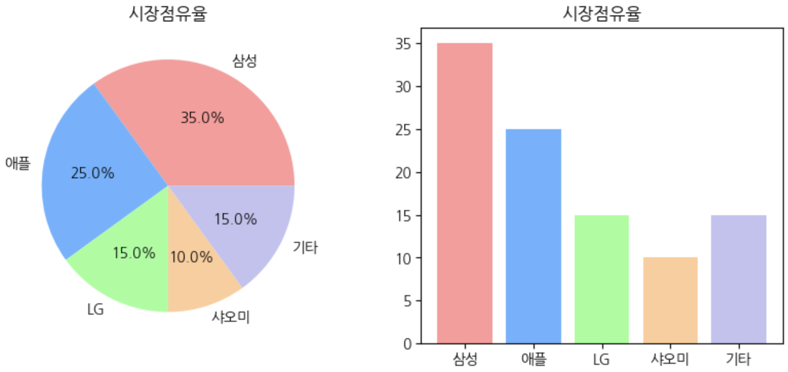
파이차트와 바 차트 조합해보기
# 실제 판매량 데이터 (단위: 만대)
actual_sales = [350, 250, 150, 100, 150]
fig, (ax1, ax2) = plt.subplots(1,2,  # (1,2) > 1x2
                               figsize=(10,4))

# 왼쪽에 파이차트
ax1.pie(market_share, labels=brands,
        colors=colors,
        autopct='%.1f%%')

ax1.set_title('시장점유율')

# 오른쪽에 바차트
ax2.bar(brands, market_share,
        color=colors
        )
ax2.set_title('시장점유율')


plt.show()
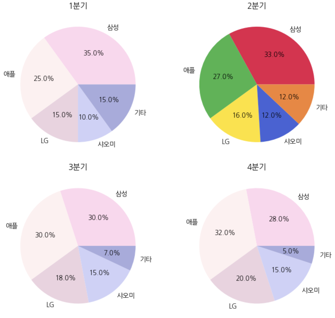
서브플롯으로 여러 파이차트 비교해보기
# 분기별 데이터
q1_data = [35, 25, 15, 10, 15]
q2_data = [33, 27, 16, 12, 12]
q3_data = [30, 30, 18, 15, 7]
q4_data = [28, 32, 20, 15, 5]
colors = ['#ffd6ee','#fff0f1','#ecd2e0','#ced1f8','#a7abde']
color2 = ['#e6194b', '#3cb44b', '#ffe119', '#4363d8', '#f58231']
fig, axes = plt.subplots(2,2,  # (2x2) > 총 4개 구현한다는 의미
                         figsize=(8,7)
                         )
# print(fig)
# print(axes)

axes[0,0].pie(q1_data, labels=brands, colors=colors, autopct='%.1f%%')
axes[0,0].set_title('1분기')
axes[0,1].pie(q2_data, labels=brands, colors=color2, autopct='%.1f%%')
axes[0,1].set_title('2분기')
axes[1,0].pie(q3_data, labels=brands, colors=colors, autopct='%.1f%%')
axes[1,0].set_title('3분기')
axes[1,1].pie(q4_data, labels=brands, colors=colors, autopct='%.1f%%')
axes[1,1].set_title('4분기')

plt.tight_layout()  # 서브플롯 간격 조절
plt.show()