 지혜의 개발공부로그
Matplotlib 사용해보기(파이차트 pie, 도넛차트)
08 Aug 2025 | Visualization개인공부 후 자료를 남기기 위한 목적임으로 내용 상에 오류가 있을 수 있습니다.
Matplotlib
import matplotlib.pyplot as plt
기본 데이터는 아래와 같다.
# 브랜드별 시장점유율 데이터
brands = ['삼성', '애플', 'LG', '샤오미', '기타']
market_share = [35, 25, 15, 10, 15]
pie
- 여러 시각화중에 넣을 수 있는 정보가 제한적
- 하나의 컬럼안에 범주형 정보를 비율로 표현
- 전체합이 100%
- 범주 갯수가 5개 이상이면, 권장되지 않는다(가독성이 떨어짐)
- 많은 컬럼들을 비율로 나타낼때, 100% 바 차트를 고려
# 파이차트 기본 시각화
plt.figure(figsize=(4,4))
# autopct='%.1f%%'
# %: 뒤에 문자들이 포매팅 규칙이 오게된다(시작점의미)
# 1.1f  실제 숫자를 어떻게 표현할지 , '.1'소수점 1자리까지 표현을 의미 | f 는 부동소수점 처리
# %%: %를 출력하라는 의미
plt.pie(market_share, labels=brands, autopct='%.1f%%')
plt.show()
파이 색상 지정
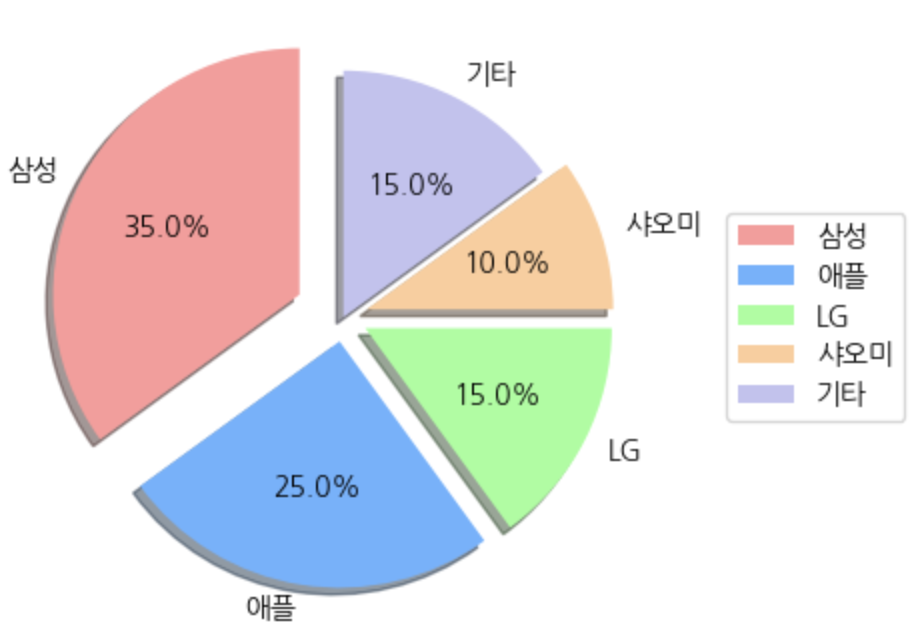
# 파이차트 색상 지정
colors=['#ff9999','#66b3ff','#99ff99','#ffcc99','#c2c2f0']

plt.figure(figsize=(4,4))
plt.pie(market_share, labels=brands,
        colors=colors,   # 색상지정
        autopct='%.1f%%',  # 숫자의 소수점 지정
        shadow=True,  # 그림자
        startangle=90,  # 시작각도
        explode=[0.2,0.1,0.1,0.1,0]  # 분리된 파이차트 > 강조하고 싶으면 0보다 크게, 아니면 0 / 0.~ 이런식으로 간격 조절 가능
        )

plt.show()
범례 및 레전드 추가
colors=['#ff9999','#66b3ff','#99ff99','#ffcc99','#c2c2f0']

plt.figure(figsize=(4,4))
plt.pie(market_share, labels=brands,
        colors=colors,
        autopct='%.1f%%',
        shadow=True,
        startangle=90,
        explode=[0.2,0.1,0.1,0.1,0]
        )

# 범례추가
# bbox_to_anchor=(1,0.5) > 범례박스가 bbox/레전드 위치 조절 (가로축, 세로축)
plt.legend(brands, loc='center left',  bbox_to_anchor=(1.1,0.5))
plt.show()
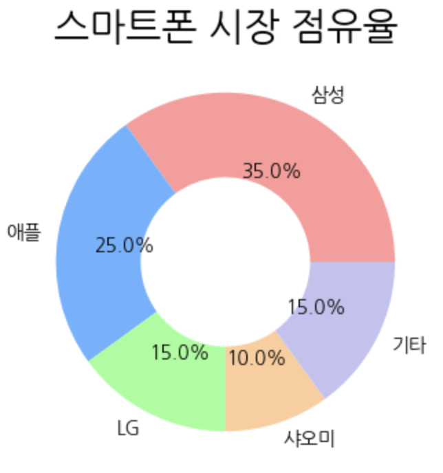
도넛차트
plt.figure(figsize=(4,4))

# wedges: 도넛 조각을 의미하는 객체리스트
# texts: 각조각의 라벨
# autotexts: 각 조각 내부숫자(비율)을 의미
wedges, texts, autotexts = plt.pie(
    market_share, labels=brands,
    colors=colors,
    autopct='%.1f%%',
    wedgeprops={'width':0.5}  # 도넛 두께 설정 > 보통 0~1사이 값 넣음
)

print(wedges)  # 도넛 객체들
print(texts)  # 좌표, 브랜드 이름
print(autotexts)  # 좌표, 퍼센트


plt.title('스마트폰 시장 점유율', fontsize=20)

plt.show()
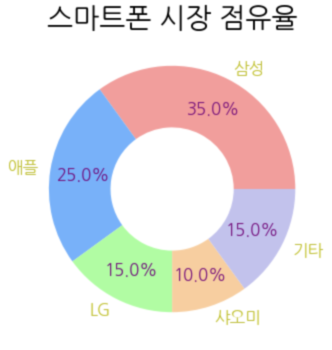
도넛 차트의 레이블과 퍼센트 분리
plt.figure(figsize=(4,4))

wedges, texts, autotexts = plt.pie(
    market_share, labels=brands,
    colors=colors,
    autopct='%.1f%%',
    wedgeprops={'width':0.5},
    pctdistance=0.73  # 안쪽 퍼센트 거리조절
)

# 퍼센트 친구들 설정해주기
for autotext in autotexts:
    autotext.set_color('purple')
    autotext.set_fontsize(12)
    autotext.set_fontweight('bold')

for text in texts:
    text.set_color('y')
    text.set_fontsize(12)
    text.set_fontweight('bold')


plt.title('스마트폰 시장 점유율', fontsize=20)

plt.show()
도넛 중간 총 텍스트 삽입
plt.figure(figsize=(4,4))

wedges, texts, autotexts = plt.pie(
    market_share, labels=brands,
    colors=colors,
    autopct='%.1f%%',
    wedgeprops={'width':0.5},
    pctdistance=0.73
)

for autotext in autotexts:
    autotext.set_color('purple')
    autotext.set_fontsize(12)
    autotext.set_fontweight('bold')

for text in texts:
    text.set_color('y')
    text.set_fontsize(12)
    text.set_fontweight('bold')

# 중앙에 총 판매량 표시
total_sales = sum(market_share)
plt.text(0,0,  # (x,y)
         f'{total_sales}%',
         horizontalalignment='center',  # 가로축을 센터에 맞춰주고
         verticalalignment='center',  # 세로축을 센터에 맞춰줌
         fontsize=20,
         fontweight='bold'
         )


plt.title('스마트폰 시장 점유율', fontsize=20)

plt.show()