 지혜의 개발공부로그
Matplotlib 사용해보기(선 그래프 plot, subplots)
07 Aug 2025 | Visualization개인공부 후 자료를 남기기 위한 목적임으로 내용 상에 오류가 있을 수 있습니다.
Matplotlib
import matplotlib.pyplot as plt
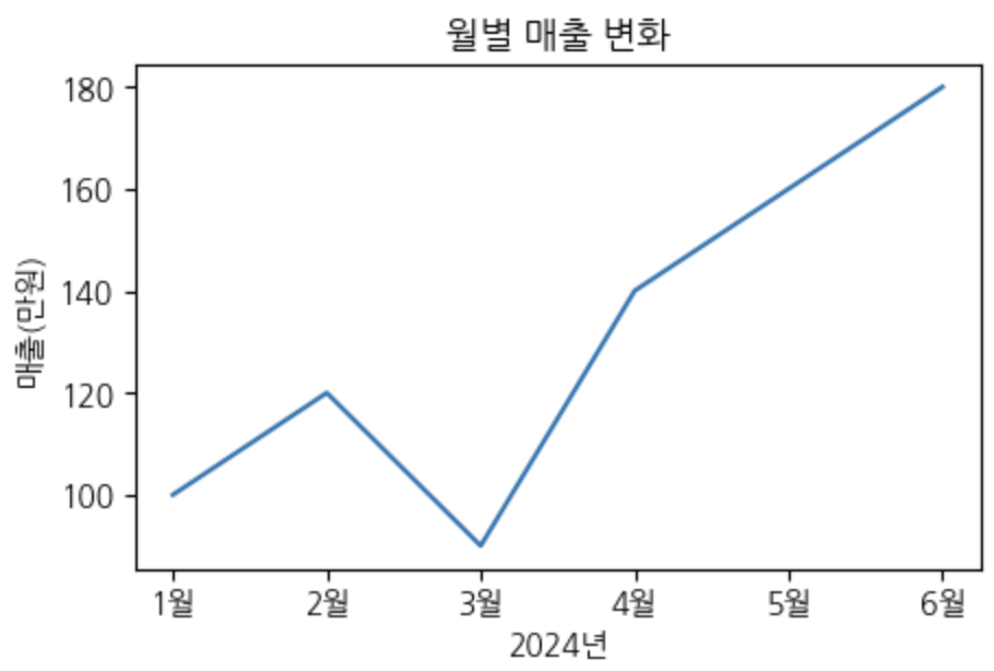
기본 데이터는 아래와 같다.
months = ['1월', '2월', '3월', '4월', '5월', '6월']
sales = [100, 120, 90, 140, 160, 180]

# DataFrame으로 만들기
df = pd.DataFrame({
    '월': months,
    '매출': sales
})
line
- 시간 변화: 매출 추이, 주가변동, 기온변화 등
- 트렌드 분석: 성장률, 감소율, 계절성 패턴 등
- 예측한 결과: 머신러닝 구동 후 결과 등
- 시축을 기준으로 한 비교 분석: 여러가지 지표(년도)를 두고 표현 가능
선차트, 바차트는 통계청 데이터와 같이 가동된 혹은 피벗된 데이터도 표현 가능!
plt.figure(figsize=(5,3))

# line chart 구현
plt.plot(df['월'], df['매출'])

plt.title('월별 매출 변화')
plt.ylabel('매출(만원)')
plt.xlabel('2024년')
plt.show()
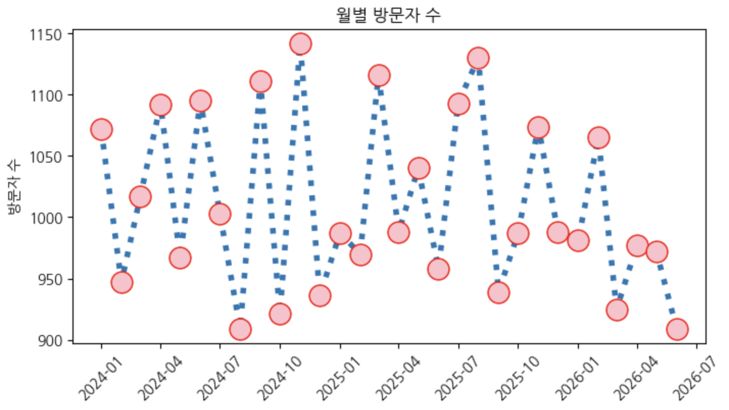
시축(시간데이터) 다루기
# 데이터
date = pd.date_range('2024-01-01', periods=30, freq='MS')
np.random.seed(0)  # 같은 정보를 보기위해서 랜덤 고정 > 이거 없으면 데이터가 계속 변함

visitors = 1000 + np.random.randint(-100,150,30)
plt.figure(figsize=(8,4))
plt.plot(date, visitors,
         ':',  # 라인 스타일 (-- & -. & : 등으로도 가능) > 라인스타일 만들어주는 위치 중요!
         marker="o",  # 각 포인트에 원하는 마커 찍기 (*, ^, o)
         markersize=15,  # 마커 사이즈
         markerfacecolor='pink',  # 마커 컬러
         markeredgecolor='red',   # 마커 라인 컬러
         linewidth=4  # 라인 굵기
         )

# x축 레이블 기울기 rotations 통해 주기
plt.xticks(rotation=45)

plt.title('월별 방문자 수')
plt.ylabel('방문자 수')
plt.show()
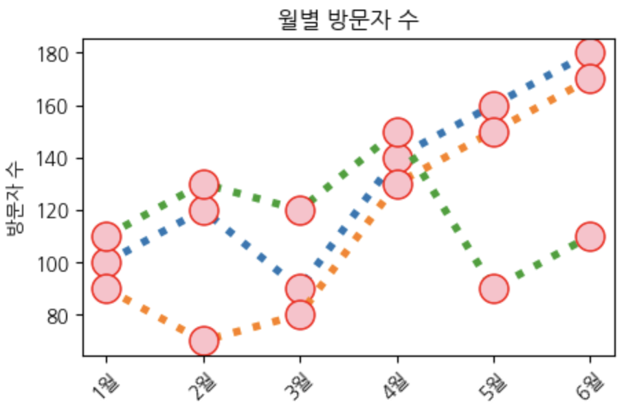
여러개의 선 그래프 구현
# 데이터
months = ['1월', '2월', '3월', '4월', '5월', '6월']
sales_1 = [100, 120, 90, 140, 160, 180]
sales_2 = [90, 70, 80, 130, 150, 170]
sales_3 = [110, 130, 120, 150, 90, 110]
plt.figure(figsize=(5,3))

plt.plot(months, sales_1,
         ':',
         marker="o",
         markersize=15,
         markerfacecolor='pink',
         markeredgecolor='red',
         linewidth=4
         )

plt.plot(months, sales_2,
         ':',
         marker="o",
         markersize=15,
         markerfacecolor='pink',
         markeredgecolor='red',
         linewidth=4
         )

plt.plot(months, sales_3,
         ':',
         marker="o",
         markersize=15,
         markerfacecolor='pink',
         markeredgecolor='red',
         linewidth=4
         )

plt.xticks(rotation=45)

plt.title('월별 방문자 수')
plt.ylabel('방문자 수')
plt.show()
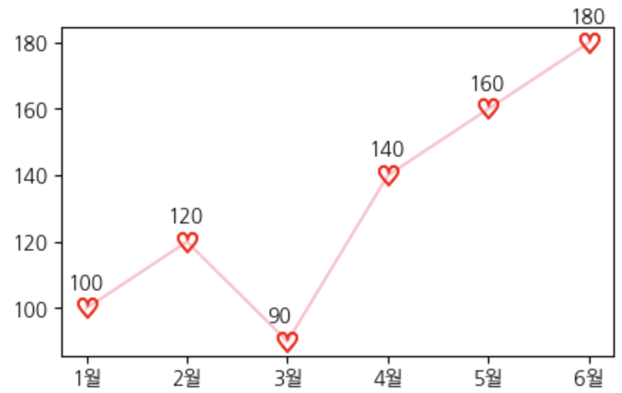
라인차트 위 어노테이션
- 바 차트에서는 text를 입혀주는 형식
- 선 차트에서는 위치를 맞춰서 어노테이션을 맞춰준다
# 데이터
months = ['1월', '2월', '3월', '4월', '5월', '6월']
sales = [100, 120, 90, 140, 160, 180]
plt.figure(figsize=(5,3))
plt.plot(months, sales,
         marker=r'$\heartsuit$',
         markersize=10,
         markeredgecolor='red',
         color='pink'
         )

# 수치를 대입하는 어노테이션
for x,y in zip(months, sales):
    # f'{y}', (x,y)에서 f'{y}'는 sales값이 들어가고
    # (x,y)는 좌표임 (1월에 100, 2월에 120을 표현해라~)
    # textcoords: 마커 위치로 부터 주변 단위 표현
    # xytext=(0,10): x축으로부터 -10포인트 이동, y축으로부터 10포인트 이동
    plt.annotate(f'{y}', (x,y), textcoords='offset points', xytext=(-10,10))

plt.show()
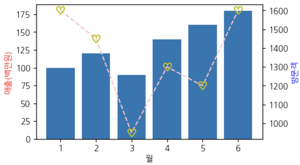
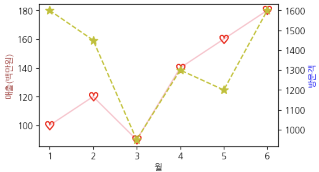
이중축 표현 > subplots
# 데이터
months = [1, 2, 3, 4, 5, 6]
sales = [100, 120, 90, 140, 160, 180]      # 매출 (백만원)
visitors = [1600, 1450, 950, 1300, 1200, 1600]  # 방문자 (명)
# fig > 테이블을 구현, 위치에 따라 셋팅이 됨 (fig1, fig2...)
# fig1에 맞춰 fig의 ax라는 듯 > (fig1 -> ax1, fig2 -> ax2)
fig1, ax1 = plt.subplots(figsize=(5, 3)) #여러 시각화를 구현할 때 사용이 된다!!

# 왼쪽 레이블
ax1.plot(months, sales, marker=r'$\heartsuit$', markersize=10, markeredgecolor='r', color='pink')
ax1.set_xlabel('월')
ax1.set_ylabel('매출(백만원)', color='brown')

# 이중축 구현하기 위한 핵심!!
ax2 = ax1.twinx()

# 오른쪽 레이블
ax2.set_ylabel('방문객', color='blue')
ax2 = ax2.plot(months, visitors,'--', marker=r'*', markersize=10, markeredgecolor='y', color='y')
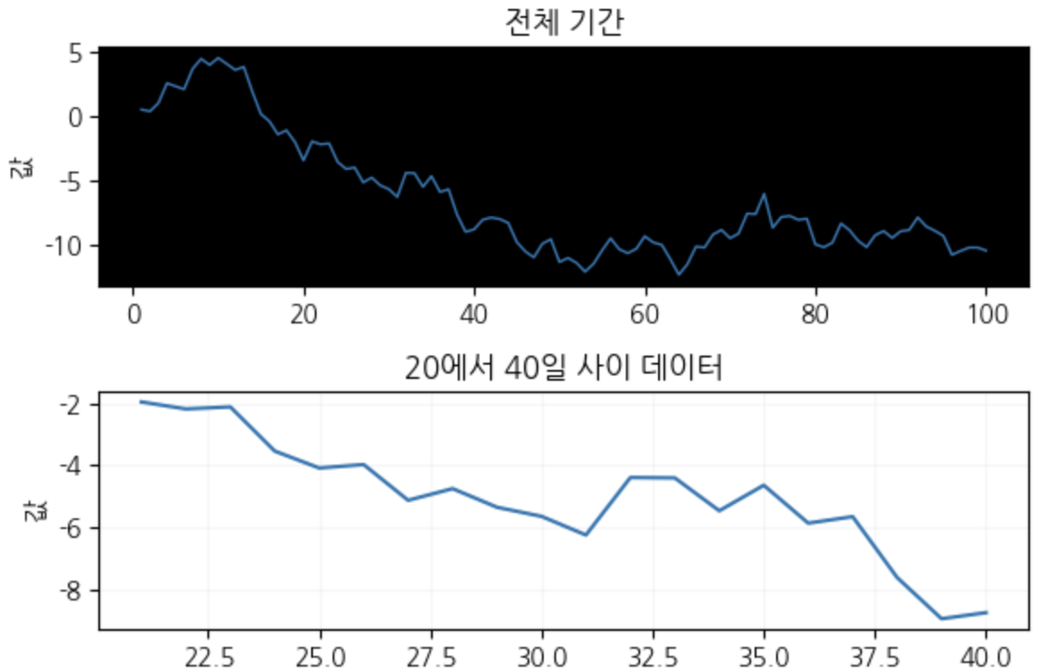
전체에서 일부를 함께 표현해보기
# 데이터 > 전체기간과 특정 구간 동시 표시
days = list(range(1,101))
np.random.seed(42)
data = np.cumsum(np.random.randn(100))
fig, (ax1, ax2) = plt.subplots(2,1,figsize=(6,4)) # 두개의 시각화가 구성이됨(2x1)

# 음수 표현 깨질 때 사용
plt.rcParams['axes.unicode_minus'] = False

ax1.plot(days, data, linewidth=1)
ax1.set_facecolor('black')
ax1.set_title('전체 기간')
ax1.set_ylabel('값')

ax2.plot(days[20:40], data[20:40])  # 특정 부분을 확대
ax2.set_title('20에서 40일 사이 데이터')
ax2.set_ylabel('값')
ax2.grid(alpha=0.1)

# 두 그래프 간 자동 여백 조절
# fig.subplots_adjust(hspace=0.5) > hspace를 통해 간격 세밀 조정 가능
plt.tight_layout()

plt.show()
콤비네이션 바-라인 차트
fig, ax1 = plt.subplots(figsize=(5, 3)) #여러 시각화를 구현할 때 사용이 된다!!

ax1.bar(months, sales)
ax1.set_xlabel('월')
ax1.set_ylabel('매출(백만원)', color='r')

ax2 = ax1.twinx()
ax2.set_ylabel('방문객', color='blue')
ax2 = ax2.plot(months, visitors,'--', marker=r'$\heartsuit$', markersize=10, markeredgecolor='y', color='pink')