 지혜의 개발공부로그
Matplotlib 사용해보기(stack bar, 100% stack bar)
07 Aug 2025 | Visualization개인공부 후 자료를 남기기 위한 목적임으로 내용 상에 오류가 있을 수 있습니다.
Matplotlib
import matplotlib.pyplot as plt
기본 데이터는 아래와 같다.
# 간단한 매출 데이터 만들기
months = ['1월', '2월', '3월', '4월', '5월', '6월']
sales_05 = [100, 120, 90, 140, 160, 180]
sales_04 = [80, 100, 97, 120, 140, 160]
sales_03 = [120, 140, 110, 160, 180, 200]

# DataFrame으로 만들기
df = pd.DataFrame({
    '월': months,
    '05매출': sales_05,
    '04매출': sales_04,
    '03매출': sales_03
})
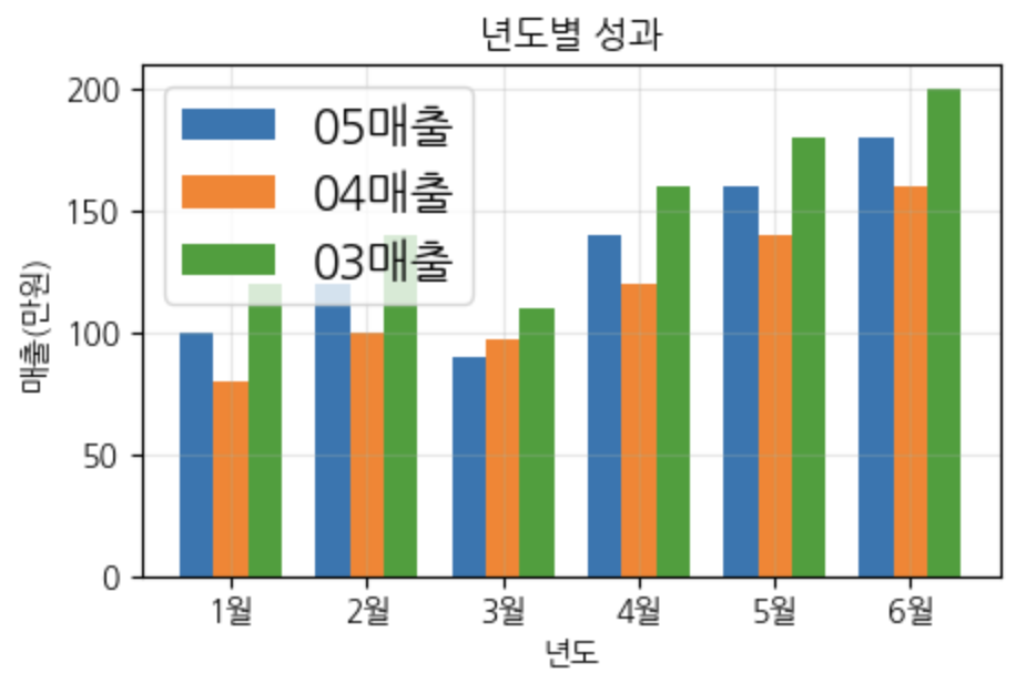
여러개의 막대차트 구현
plt.figure(figsize=(5,3))

x = np.arange(len(months))
width = 0.25

# (표현할 막대의 위치, 데이터, 막대넓이)
plt.bar(x-width, df['05매출'], width)
plt.bar(x, df['04매출'], width)
plt.bar(x+width, df['03매출'], width)

plt.xticks(x, df['월'])

# 레전드 설정
# plt.legend(['2023', '2024', '2025'], loc='upper right')
plt.legend(df.columns[1:], fontsize = 15)  # 레전드의 폰트사이즈
plt.title('년도별 성과')
plt.ylabel('매출(만원)')
plt.xlabel('년도')

# 그리드 / 투명도 설정
plt.grid(True, alpha=0.3)
plt.show()
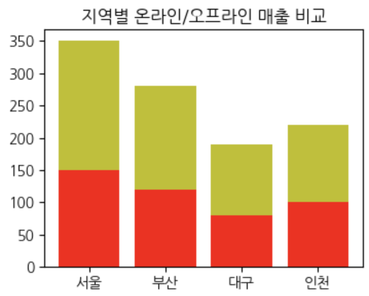
Stack Bar
# 데이터: 지역별 온라인/오프라인 매출
regions = ['서울', '부산', '대구', '인천']
online_sales = [150, 120, 80, 100]
offline_sales = [200, 160, 110, 120]

plt.figure(figsize=(4,3))

plt.bar(regions, online_sales)
# online_sales 아래에 표현하겠다 의미
plt.bar(regions, offline_sales, bottom=online_sales)

plt.title('지역별 온라인/오프라인 매출 비교')
plt.show()
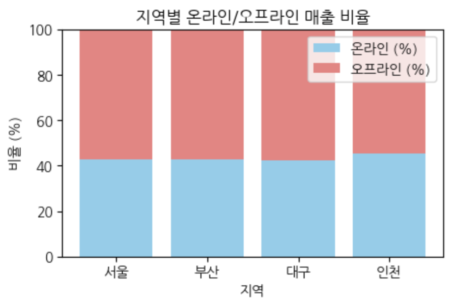
100% Stack Bar
- 파이차트와 역할이 비슷
- 데이터의 비율을 표현할 때 사용
# 비율로 변환
total_sales = [online + offline for online, offline in zip(online_sales, offline_sales)]
online_pct = [online/total*100 for online, total in zip(online_sales, total_sales)]
offline_pct = [offline/total*100 for offline, total in zip(offline_sales, total_sales)]

plt.figure(figsize=(8, 6))
plt.bar(regions, online_pct, label='온라인 (%)', color='skyblue')
# bottom=online_pct > 데이터를 비율로 전환후, stack 표현
plt.bar(regions, offline_pct, bottom=online_pct,
        label='오프라인 (%)', color='lightcoral')

plt.title('지역별 온라인/오프라인 매출 비율')
plt.xlabel('지역')
plt.ylabel('비율 (%)')
# y축의 범위를 설정 (최소0, 최대100)
plt.ylim(0, 100)
plt.legend()
plt.show()